
Rebecca was beginning to feel quite excited. A miniature publishing office - what fun! - and what were they going to publish?
Even as she mentally asked that question, Tish jumped up on a chair and answered it. "Well, this is it! I've been practising typing in the holidays to be able to type the stencils. Mara has turned up with the machine, just as she said she would. From now on we can produce our own House publication - The Juniper Journal!"
"Hurray!" There was cheering and stamping of feet.
(Anne Digby, First Term at Trebizon, Puffin, London, 1978, pp47-8)
 The
publishing project which became Bettany Press developed as a result of
a meeting between myself and feminist academic Rosemary Auchmuty in January
1993. At this point Auchmuty's study of girls' school fiction, A World
of Girls (The Women's Press, London, 1992) had recently been published.
During the course of our meeting, Auchmuty revealed that part of her book
had been cut by the publishers, in order to keep the price as low as possible.
The missing chapters, about the roles of girls' organisations in girls'
school stories, were not substantial enough to be published on their own,
but nonetheless would be of interest to anyone who had enjoyed Auchmuty's
book.
The
publishing project which became Bettany Press developed as a result of
a meeting between myself and feminist academic Rosemary Auchmuty in January
1993. At this point Auchmuty's study of girls' school fiction, A World
of Girls (The Women's Press, London, 1992) had recently been published.
During the course of our meeting, Auchmuty revealed that part of her book
had been cut by the publishers, in order to keep the price as low as possible.
The missing chapters, about the roles of girls' organisations in girls'
school stories, were not substantial enough to be published on their own,
but nonetheless would be of interest to anyone who had enjoyed Auchmuty's
book.
bet1
For my part, I had completed an MA thesis (part-republished
here as 6. The World of the Chalet School![]() ),
also entitled A World of Girls (but subtitled Schoolgirl Fiction:
Genre, Femininity and the Chalet School), in March 1992. This had remained
unread - except by its examiners and by various members of the academic
staff at the Universities of East London and Kent - until I had come into
contact with the girls' school story fan network in late 1992. However,
I was now receiving regular requests from fans to borrow, and sometimes
to copy the thesis. Although, at 50,000 words, it was almost book length,
I did not believe that it was strong enough to stand alone for publication,
but I did believe that part of it could be edited to form a chapter in
a collection.
),
also entitled A World of Girls (but subtitled Schoolgirl Fiction:
Genre, Femininity and the Chalet School), in March 1992. This had remained
unread - except by its examiners and by various members of the academic
staff at the Universities of East London and Kent - until I had come into
contact with the girls' school story fan network in late 1992. However,
I was now receiving regular requests from fans to borrow, and sometimes
to copy the thesis. Although, at 50,000 words, it was almost book length,
I did not believe that it was strong enough to stand alone for publication,
but I did believe that part of it could be edited to form a chapter in
a collection.
bet2
At the same time, Auchmuty and I had recently come into
contact with a number of fans who also had an academic interest in girls'
school stories, and we were interested in breaking down the traditional
divide between those studying and those reading popular fiction. We felt
that this was an artificial divide, sustained by the widespread use of
academic language and by the lack of access by women outside the academy
to the academic framework which characterises many Cultural Studies texts.
We therefore decided to produce a proposal for a collection of essays about
girls' school stories, which we would introduce and edit ourselves, and
each contribute a chapter to based on the aforementioned material. We would
draw the contributions from women whom we knew to be fans, whether they
were part of the fan networks or not, and we would look specifically at
the Chalet School series, to link in with the planned celebrations of Elinor
M. Brent-Dyer's birth centenary in 1994. The title we chose was The
Chalet School Revisited, to reflect the fact that we were taking a
fresh look at a genre which had been widely ridiculed since the early part
of the twentieth century.
bet3
We sent this proposal![]() to a number of publishers with academic and/or Women's Studies lists, but
the initial response was unenthusiastic. This, we believed, reflected a
wider attitude to girls' and women's popular culture which was, at best,
dismissive. In any case, we were concerned about the fate of the book in
the hands of an unsympathetic editor, and about the pressures which might
be put on us by publishers to change or to dilute our original vision.
We therefore explored the possibility of publishing the book ourselves.
On the basis of printers' quotes and discussions with fans, we decided
that it would be viable to print 1,000 copies and sell them for £9.99
each, principally by mail order. We set a publication date of December
1994, so that the book became the last "event" in the calendar of centenary
celebrations. We had already discussed the possibility of holding a conference
that month; now the conference could also be used to launch the book
to a number of publishers with academic and/or Women's Studies lists, but
the initial response was unenthusiastic. This, we believed, reflected a
wider attitude to girls' and women's popular culture which was, at best,
dismissive. In any case, we were concerned about the fate of the book in
the hands of an unsympathetic editor, and about the pressures which might
be put on us by publishers to change or to dilute our original vision.
We therefore explored the possibility of publishing the book ourselves.
On the basis of printers' quotes and discussions with fans, we decided
that it would be viable to print 1,000 copies and sell them for £9.99
each, principally by mail order. We set a publication date of December
1994, so that the book became the last "event" in the calendar of centenary
celebrations. We had already discussed the possibility of holding a conference
that month; now the conference could also be used to launch the book![]() .
.
bet4
(Auchmuty and I were, of course, both published writers,
although the bulk of my experience was in journalism![]() .
I had also worked extensively as an editor, although, as I was to discover,
this required different skills to book editing
.
I had also worked extensively as an editor, although, as I was to discover,
this required different skills to book editing![]() .
Perhaps most importantly, I had a background in DIY or "covert culture"
publishing, and my first two professional jobs had involved founding and
editing magazines with very little support. Had it not been for these experiences,
we may not ever have considered "smallpress" publishing.)
.
Perhaps most importantly, I had a background in DIY or "covert culture"
publishing, and my first two professional jobs had involved founding and
editing magazines with very little support. Had it not been for these experiences,
we may not ever have considered "smallpress" publishing.)
bet5
Once we had decided to go ahead, we confirmed the final list of contents. This was:
We also issued contributors with a series of guidelines on content and style. We emphasised that:
The first stage in the production process was editing
the copy. This was a two-stage process. First, we edited for content. Auchmuty
and I worked collaboratively with the other contributors, taking primary
responsibility for three writers each (we also acted as each other's editor).
Initially, we discussed the content and direction of each essay with the
writer, trying to avoid being prescriptive whilst still conveying an understanding,
where necessary, of what a "critical" essay might offer. Following this,
we worked through a number of drafts with each writer, after discussing
these with each other first.
bet8
The second stage of the editing was copy editing, and
here we were fortunate to receive an offer of help from Joy Wotton, one
of a number of fans working in book publishing. Since copy editing involves
putting text into "house style" - making spellings and so on consistent
- as well as checking for grammar, readability and accuracy, Wotton also
helped us to decide just what this style should be. Should we hyphenate
boarding-school? Should Headmistress be capitalised or not? Was "Elinor"
an acceptable way to refer to Brent-Dyer? (Some fans wrote simply of EBD,
as they did in their newsletters.) Having made these decisions, Wotton
also helped us to restructure and rewrite the essays further.
bet9
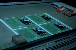
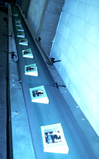
The third stage in the production
process was designing and typesetting the copy. In order to implement this,
I used Quark XPress 3.31, the industry standard "desktop publishing" (DTP)
software, with Photoshop 2 to manipulate the illustrations. Since the book
"revisited" the series, I decided to "revisit" the first books published,
with the aim of producing a tribute design. These first editions consist
of a hard cover, in red or blue, with the title stamped between narrow
rules in gold, surrounded by a full-colour paper dustwrapper. Inside, opposite
the title page, is a black and white frontispiece illustration. The original
dustwrappers and frontispieces were illustrated by Nina K. Brisley, who
is generally accepted as being the most popular of the Chalet School illustrators.
bet10
We could not afford to print a book with a hard cover,
which in any case would have increased its weight and thus the costs of
postage and packing. I therefore decided to produce a paperbacked book,
measuring 198mm deep by 129mm wide. I retained the width of the original
text, at 93mm, but decreased the size of the margins and extended the number
of lines of text from 34 to 37. Since we could not afford to print a full-colour
cover, I decided to ignore the dustwrapper, which was after all the most
ephemeral part of the book and the least likely to have survived into the
1990s (this, of course, makes them highly prized by collectors). In addition,
we were featuring photographs of dustwrappers and other Chalet School illustrations
from throughout the century in Clarissa Cridland's chapter. Instead, I
decided to retain the red colour of the original hard covers, together
with the use of the gold title and rules, but to increase the size of the
book title, author's name and the rules.
bet11
I also decided to place a black and white illustration
on the front cover, as if the reader was seeing through to the frontispiece
(although in fact this would have had to be reversed, since the illustration
in the original edition was on the left-hand page). With the help of contributor
Gill Bilski, I chose a black and white illustration from The Chalet
School and Jo (1931), since the incident it depicts is easily recognisable
to any generation of Chalet School readers. (The illustration also has
a timeless quality which enhances this recognition.) The design of the
back cover was copied unashamedly from the design of Auchmuty's A World
of Girls (The Women's Press, 1992), using black type to enhance readability.
bet12
Moving on to the typeface, I decided to use New Century
Schoolbook, a modern and easier-to-read version of the Century Schoolbook
typeface which had been used for the first editions (the name was also
apt). I used 11pt text on 12pt leading for the body text, and 12pt capitals
for the chapter title and 8pt capitals for the author's name, mirroring
the first editions. I also used a running head and pagination system which
was similar to that used in the first editions. Because of the increased
number of lines of text in the Bettany Press book, though, I decided to
centre the body copy vertically, using the running head to give the illusion
that there was more space below the text than above, as is book style (this
is because the eye is believed to drop the text in the frame and thus perceives
it as still being centred).
bet13
In retrospect, there were a number of problems with this
design, which were exacerbated by the fact that "The Chalet School Collection"
eventually grew to four books, all using the same basic design. In general,
the reality of using gold ink meant that the lettering was difficult to
read. This was exacerbated in The Chalet School Revisited by my
use of a horizontal title on the spine, to reflect the original design
and to allow space for an illustration. In fact, the lettering and rules
would have had to have been embossed or stamped on to the cover for the
design to have worked properly. However, the gold was more effective against
the gentian blue of the second book cover, Visitors for the Chalet School![]() ,
and on the advice of a fan, Marie Hrynzcak, I replaced it with silver for
the following two books.
,
and on the advice of a fan, Marie Hrynzcak, I replaced it with silver for
the following two books.
bet14
 The
size of the book also proved to be problematic, in that its height fell
between the capacities of two different types of binding machines (we were
not, however, informed of this by the printers). As a result, the following
book, Visitors for the Chalet School, had to be retrimmed, since
it was originally trimmed 6cm too high, and the fourth book, Jean of
Storms
The
size of the book also proved to be problematic, in that its height fell
between the capacities of two different types of binding machines (we were
not, however, informed of this by the printers). As a result, the following
book, Visitors for the Chalet School, had to be retrimmed, since
it was originally trimmed 6cm too high, and the fourth book, Jean of
Storms![]() ,
had to be completely reprinted as it was too short. (By this time we were
constrained by the need to produce books of at least approximately the
same size, since fans could be expected to want to place them together
on their shelves.) The problems caused by the books' size were exacerbated
by the use of rules, which meant that any diminution in the height of the
book
placed the rules too close to the edge of the cover to be aesthetically
pleasing.
,
had to be completely reprinted as it was too short. (By this time we were
constrained by the need to produce books of at least approximately the
same size, since fans could be expected to want to place them together
on their shelves.) The problems caused by the books' size were exacerbated
by the use of rules, which meant that any diminution in the height of the
book
placed the rules too close to the edge of the cover to be aesthetically
pleasing.
bet15
 The
use of the rules also meant that the covers had to be placed on the books
in exactly the right position, since the rules were placed equidistantly
close to the top and bottom of the cover and any error was immediately
noticeable. The use of running heads, meanwhile, meant that the book needed
to be folded perfectly, in order that the text lined up exactly on facing
pages, since the running heads had the effect of drawing the reader's attention
to any differences. Equally, centring the body text vertically, rather
than allowing more space at the bottom of the page, relied on the binders
following the design exactly. In fact, what happened with The Chalet
School Revisited was that the covers were not placed correctly by the
binders, so that the rules were not equidistant from the top and bottom.
"Correcting" this problem when trimming the books then meant that the body
text was not centred vertically but had more white space left at the top
of the page than the bottom, in a reversal of correct book style. This
meant that The Chalet School Revisited also had to be partially
reprinted.
The
use of the rules also meant that the covers had to be placed on the books
in exactly the right position, since the rules were placed equidistantly
close to the top and bottom of the cover and any error was immediately
noticeable. The use of running heads, meanwhile, meant that the book needed
to be folded perfectly, in order that the text lined up exactly on facing
pages, since the running heads had the effect of drawing the reader's attention
to any differences. Equally, centring the body text vertically, rather
than allowing more space at the bottom of the page, relied on the binders
following the design exactly. In fact, what happened with The Chalet
School Revisited was that the covers were not placed correctly by the
binders, so that the rules were not equidistant from the top and bottom.
"Correcting" this problem when trimming the books then meant that the body
text was not centred vertically but had more white space left at the top
of the page than the bottom, in a reversal of correct book style. This
meant that The Chalet School Revisited also had to be partially
reprinted.
bet16
 Aside
from the use of gold ink, all of the problems which resulted from the design
were due to inefficiency during the print process, and were - sooner or
later - accepted as such by the printers. However, a clearer understanding
of the print process and the level of competence of the industry generally
means that I would not knowingly have produced a design which relied on
a perfect job being carried out at every stage, and would advise discussing
design with printers during the editing stage to prevent similar problems
from occurring. I would also warn women that printers are almost entirely
male-run businesses; and that a sexist atmosphere is very common, for example
the widespread use of pornographic pictures for "decoration". This is not
an easy atmosphere in which to discuss any problems which have arisen.
Aside
from the use of gold ink, all of the problems which resulted from the design
were due to inefficiency during the print process, and were - sooner or
later - accepted as such by the printers. However, a clearer understanding
of the print process and the level of competence of the industry generally
means that I would not knowingly have produced a design which relied on
a perfect job being carried out at every stage, and would advise discussing
design with printers during the editing stage to prevent similar problems
from occurring. I would also warn women that printers are almost entirely
male-run businesses; and that a sexist atmosphere is very common, for example
the widespread use of pornographic pictures for "decoration". This is not
an easy atmosphere in which to discuss any problems which have arisen.
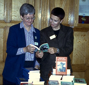
bet17
Despite these difficulties, though, The Chalet School
Revisited was duly published on 3 December 1994, launched at our conference
Studying
Girls' Popular Fiction![]() .
It was later to receive reviews in The Independent on Sunday (The
Sunday Review, 2 April 1995, p38), Evergreen (Spring 1995, p134)
and Folly (July 1995, pp17-18). We believed
that this was the natural end of the Bettany Press project, but then, in
February 1995, I was approached by Elinor M. Brent-Dyer's biographer, Helen
McClelland, and was asked if Bettany Press would publish a full-length
manuscript which she had written in the 1970s to entertain her teenage
daughters. This manuscript, Visitors for the Chalet School, was
intended to fill a "gap" in the series within the books written at the
end of the 1920s. Although McClelland had already found a publisher, he
could not publish the book until 1996. She wanted it to be published in
1995, as this would be exactly seventy years after the publication of Brent-Dyer's
first book in the series, The School at the Chalet.
.
It was later to receive reviews in The Independent on Sunday (The
Sunday Review, 2 April 1995, p38), Evergreen (Spring 1995, p134)
and Folly (July 1995, pp17-18). We believed
that this was the natural end of the Bettany Press project, but then, in
February 1995, I was approached by Elinor M. Brent-Dyer's biographer, Helen
McClelland, and was asked if Bettany Press would publish a full-length
manuscript which she had written in the 1970s to entertain her teenage
daughters. This manuscript, Visitors for the Chalet School, was
intended to fill a "gap" in the series within the books written at the
end of the 1920s. Although McClelland had already found a publisher, he
could not publish the book until 1996. She wanted it to be published in
1995, as this would be exactly seventy years after the publication of Brent-Dyer's
first book in the series, The School at the Chalet.
bet18
As Auchmuty was agreeable, I decided to go ahead, since this would allow me to develop my publishing skills further. It would also allow me to explore further a phenomenon already apparent from the fanzines, where readers were making up their own stories about the characters. The project could not have been completed successfully, however, without Joy Wotton, who worked extensively with McClelland to rewrite the manuscript. Visitors for the Chalet School, illustrated with line drawings by fan Anne Thompson and with a gentian blue cover (the colour of the school uniform in the later books, as well as the colour of the boards of some early issues), was published on 19 June 1995, with a launch party held at The Wheel women's centre in London.
"There's a featured girl, Patricia Davidson, who hopes that Joey will help her realise her dreams of becoming a doctor, and all the usual obsessions with the weather and gorging ('delicious spicy soup . . . Blaubeeren Torte with whipped cream and finally plates of Viennese honey and nut biscuits'). McClelland has a wonderful knack for period detail, coming up with Elinor-esque party games, songs, slang." - Suzi Feay, Independent on Sunday (9 July 1995, p40)
This again appeared to
be the end of the Bettany Press project. However, McClelland then asked if Bettany
Press would be interested in publishing a revised edition of her 1981 biography,
Behind the Chalet School. This book had been vital
during my MA research, and I knew that McClelland had uncovered a great deal
of new material since it was originally published. Working with her would allow
me to find out more about both the biographical process and the life and work
of Elinor M. Brent-Dyer, extending my understanding of the books and of the
relationship between the text and the author. It would also allow me to develop
my publishing skills still further. Managing the distribution, had, of course,
by this time become problematic, but my sister agreed to take over this side
of the project from us.
bet20
Behind the Chalet School, with the original pictures
and a rich brown cover (the original Chalet School uniform being brown),
was eventually published in July 1996, although production delays meant
that its publication had already been heralded at the second Bettany Press
conference, A Celebration of Girls' School Story Writers, on 9 December
1995![]() .
.
In this biography, Miss Brent-Dyer is described variously as a kind and generous person, an eccentric and excitable sort of person, a larger than life flamboyant sort of person, a very forthright person, very reserved until you got to know her. Elinor's books were read all over the world and she received glowing reviews. I'm sorry I failed to discover the Chalet School series. I feel I missed out. - Georgina Rand, Catholic Times
With three related books published,
this again appeared to be the natural end of the project. However, in late
1995, centenary organiser Polly Goerres contacted me with news of "an amazing
discovery". Previously it had been thought that Elinor M. Brent-Dyer had
never written for adults - although McClelland believed that she had wanted
to - and had never written about her birthplace, South Shields. Now Doris
Johnson, a librarian in South Shields, had discovered an adult novel, Jean
of Storms, set locally, which had never been published in book form,
but which had been serialised in the Shields Gazette in 1930. Goerres,
like many of the fans, was anxious for the opportunity to own a copy in
book form. Initially this seemed problematic, because of doubt over who
owned the copyright. Eventually, however, with advice from the NUJ and
permission from Brent-Dyer's heir, the actress Chloe Rutherford, we were
able to go ahead.
bet22
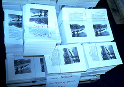
 Jean
of Storms, illustrated with contemporary photographs of South Shields
and folk dancing and with a jade cover (this being the heroine's favourite
colour), was published on 21 September 1996, launched at the first Annual
General Meeting of the New Chalet Club at South Shields Town Hall in the
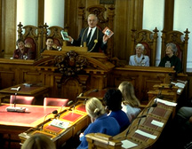
presence of the Mayor of South Shields.
Jean
of Storms, illustrated with contemporary photographs of South Shields
and folk dancing and with a jade cover (this being the heroine's favourite
colour), was published on 21 September 1996, launched at the first Annual
General Meeting of the New Chalet Club at South Shields Town Hall in the
presence of the Mayor of South Shields.
 The
publication of Jean of Storms was also reported in The Shields
Gazette (17 September 1996); The [Newcastle] Journal
(17 September 1996); The Times (18 September 1996); The Daily
Telegraph (18 September 1996); on Sun City Radio, BBC Radio Newcastle,
Moray Firth Radio and Tyne Tees Television; and Helen McClelland was also
interviewed on the BBC Radio 2 John Dunne Show (1 September 1996). As with
Brent-Dyer's Chalet School series, we had had no idea of what we had begun
when we first conceived of the project as a one-off book proposal.
The
publication of Jean of Storms was also reported in The Shields
Gazette (17 September 1996); The [Newcastle] Journal
(17 September 1996); The Times (18 September 1996); The Daily
Telegraph (18 September 1996); on Sun City Radio, BBC Radio Newcastle,
Moray Firth Radio and Tyne Tees Television; and Helen McClelland was also
interviewed on the BBC Radio 2 John Dunne Show (1 September 1996). As with
Brent-Dyer's Chalet School series, we had had no idea of what we had begun
when we first conceived of the project as a one-off book proposal.
| Dr Ju Gosling aka ju90's ABNORMAL: How Britain became body dysphoric and the key to a cure is available now for just £3.09 for the Kindle or in a limited-edition hardback with full-colour art plates for £20 inc UK postage and packing. |  |